5 Tips to Tap Into the Mobile Marketing Revolution

SHARE WITH OTHERS
Marketing’s going mobile. In fact, a mobile marketing revolution is taking Canada by storm:
- Nearly 2 out of 3 shoppers use at least one device to research and purchase while shopping.
- Another 28% use two at a time.
More than 1 in 3 shoppers made at least one purchase with their mobile devices during the past 6 months … tablet shoppers have an even higher tendency to purchase.
Maybe your small business doesn’t have a mobile-friendly site yet. But do you need one?
1: Define your need for a mobile site
Competitor analysis Before you start developing a mobile site, figure out if you really need one. Start by checking out your competitors’ (always the first step in frugal market research) websites on your phone. If your local competitors are mobile-web-friendly, it’s a strong sign you should be too.
Desktop site review Next, analyze the stats for your desktop site. Google Analytics can tell you which mobile devices your customers are using to visit your website. You may learn that a sizeable percentage of your traffic actually comes from mobile. Dig further to see what your mobile users are doing. Two critical statistics are bounce rate and session duration.
Bounce rate measures the percentage of visitors that view only a single page on your site (single-page websites, by definition, have a high bounce rate). A high bounce rate on mobile traffic, relative to your desktop traffic, is an indication of a poor user experience.
Session duration measuresthe time spent by a visitor on your website. Low session durations for users on a mobile device is another strong indicator that your mobile users are either not finding what they seek, or are having difficulty doing so.
If your competitors are mobile ready, and/or or your mobile visitors are having a poor experience then you’re losing business.
2: Know your mobile options
Let’s say your analysis indicates a mobile site is essential. You have 3 routes to make your business mobile friendly.
Responsive design:
Responsive design automatically adjusts the layout of your website depending on the device someone is using. In this example, you can see that the navigation, imagery, content and look of Just Ahead’s responsive website renders well regardless of device: tablet (portrait and landscape view), smartphone, notebook or desktop computer.
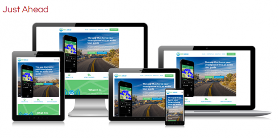
Image sourced from www.bourncreative.com
Separate mobile site
Has your business already invested in a desktop website? A separate mobile site, rather than responsive design, may be the way to go. If your desktop site is more important for your business and needs unique features, this may be your best choice.
Note however that a separate mobile site is not as adaptable as a responsive design website. Your mobile website may not work on next-gen mobile devices.
Mobile app
If your visitors visit daily, a mobile app makes sense. It’s not typically the preferred option for most small business owners, but it may be right for yours.
3: Keep it simple
Mobile websites need simple navigation, easy-to-read text and highly visible call-to-action buttons that draw your visitors through your site.
As you design, consider what people expect to see and what matters most to them. Think about the information they want to access quickly:
- A restaurant should ensure its menu is easy to find.
- A hotel wants reservation information to be prominent.
- Retail locations need location maps and hours of opening.
4: Create a similar user experience across devices
Use your mobile site to reinforce your company brand. The look and feel of your mobile site should be similar to your desktop site – and so should the user experience, whether from smart phone, tablet or desktop.
Make sure the user experience is positive – slow-loading pages are an SEO no-no.
5: Social networks
Last but never least, don’t forget about social. Include social ‘like’ and share buttons on your pages. Encourage visitors to comment on your blog. Social sharing creates word-of-mouth recommendations by allowing users to talk about your business – and spread the word.
The mobile revolution has barely begun
Canadians are keen adopters of new technology; 3 out of 4 of us own smartphones, well above the rates in the U.S.A. In fact, only two countries in the world (Spain and the U.K.) boast higher smartphone adoption than we do. Not to mention, smartphone users skew younger and higher-income than owners of basic cellphones.
Here’s a trend you may not have suspected – desktop usage of the web went down in Canada in 2013. You can guess why though – access through tablet and smartphone is rising so rapidly. If your website isn’t mobile ready yet, keep your ear to the ground – it may be time to do so soon.
Contact:
Jessica Miller – Marketing Coordinator
Twitter/@411_ca | Facebook/411ca
SHARE WITH OTHERS
About 411dotca Blog
Subscribe to our blog
CONNECT WITH US
@411dotca Tweets
411dotca Facebook
DISCLAIMER
